Without doubt, the fabric of the world has changed between the last post and this. Suffice to say, nothing will be quite the same after this. I’m pretty sure in half a year normalcy will resume – but our paths in getting there can vary. First scenario is the discovery of an establish antiviral treatment/vaccines (over a longer time frame) and perhaps just a global flattening of curves. Second possible scenario is a more apocalyptic trajectory – infections raging and deaths continue unabated as herd immunity becomes du jour again as humans adapt to the changing landscape.
Clearly we will not be out and about as actively as we were pre-covid but humans are malleable, adaptable communities that will find a way to build a life around the impending, looming threat of Covid-19. One of the positive corollaries of the outbreak is that people have been forced into the deep end of the pool through sudden changes in their routines, and now incorporating many new aspects into their daily lives that they would have kicked down the road under more normal circumstances. Timescales have been compressed over the passed 2-3 months – everyone forcibly accelerating their pace of adoption in order to survive.
As an introvert, social (or more appropriately, physical) distancing comes naturally. As countries rush to impose varying degrees of movement controls in an attempt to flatten the curve and reduce the reproduction number of the virus, I’ve been interested in understanding the interplay between policy responses (to the extent that they are quantifiable) and the resultant impact it on what I think are 2 barometers of societal normalcy – mobility and spending.
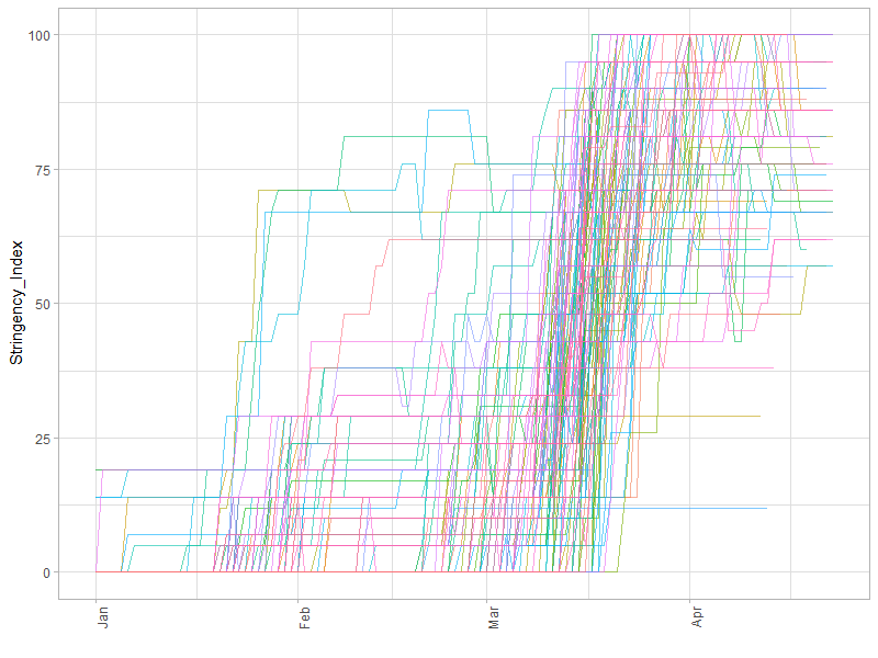
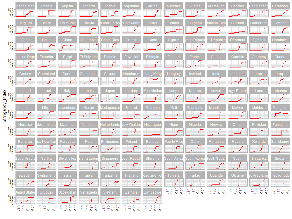
This is from the Blavatnik School of Government at the University of Oxford. They’ve built an indicator that aims to track and compare policy responses around the world, in a systematic manner by tracking information on several different common policy responses governments have taken, and aggregates these scores into what they define as a common Stringency Index. A team of more than a hundred students and staff from OxCGRT collects publicly available information on 13 indicators of government response. Nine of the indicators take policies such as school closures, travel bans, etc, and are recorded on an ordinal scale; the others are financial indicators such as fiscal or monetary measures. For a full description of the data and how it is collected, see this working paper.
The next step is in looking at the corollary impacts of the policy responses, this in terms of mobility (I’ll keep spending as a separate, future post). Here I’m using data from CityMapper, where their Mobility Index is calculated by comparing trips planned in the Citymapper app to a recent typical usage period. “Our users are public transport users and also use us for walking, cycling, and some micromobility and cabs. We are not used for driving. We do not track the demographics of our users. We have enough data in our published cities to be confident that it represents a real change in behaviour. However, it is a sample set of general mobility and may not represent the real world exactly.”

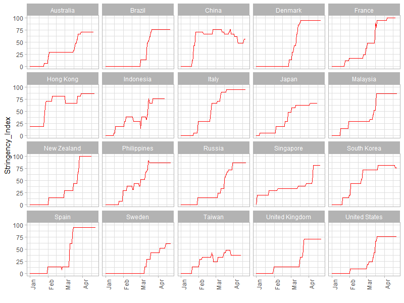
Next, I map the cities to their respective countries (or rather, choose a representative city for each country e.g. Madrid rather than Barcelona for Spain, NYC for the United States not San Francisco). Joining the policy response and mobility datasets on countries and dates, we can look at the impact of the stringency of each country’s policy response on how active people are in terms of their day-to-day movements.

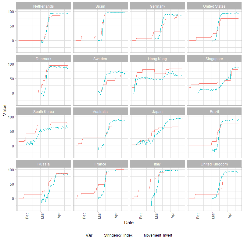
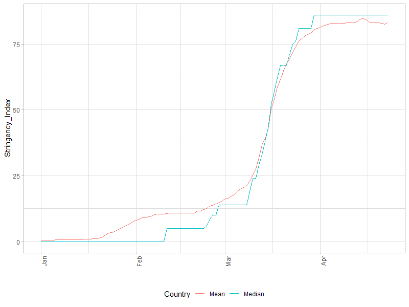
What’s interesting in the last chart is observing the follow-on impact of changes in policy response to people’s movement across countries. Socially responsible behavior is such times manifest in the lag between their movements (teal line) and policy changes (red line). While mobility data is lacking for a few countries before March, the high baseline values on March 1 is telling.
1. Whereas most Nordic (+ Germany/Netherlands) and Asian countries tend to exhibit reduced mobility almost instantaneously, even in the early days of the outbreak (where positive consequences are most significant) – Australians, French and Italians were dragging their feet.
2. Swedes, for all their government’s inclinations towards herd immunity, demonstrate and admirable proclivity towards social responsiveness and responsibility. On average it even overshoots.
3. The US tends to show high responsiveness likely because I chose NYC as the representative city, which has been the hardest hit.
Here’s looking forward to the big reset.